March 26, 2024
DesignLog
State of Things
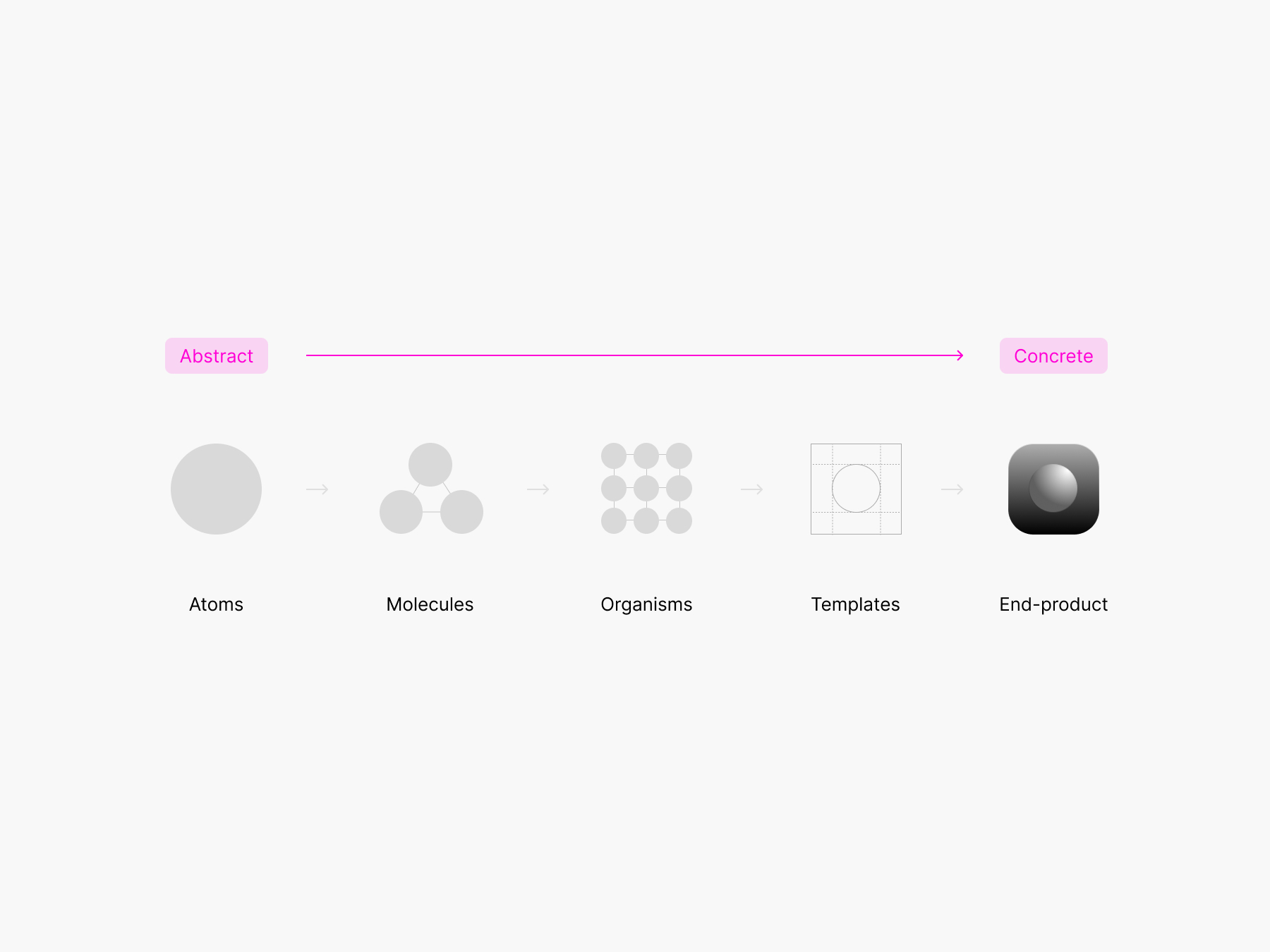
Most software design documentation sites are related to their design systems. The atomic design framework provides a straightforward nesting for the different levels:
> Foundations/principles/guide
+ Page
+ Page...

> Patterns & components
+ Intro
+ - Primitives (Atoms)
+ -- Components (Molecule + Organisms)
+ ---- Templates
Each level gets its technical specs and guidelines, often with sandboxes, examples, do/don't, notes on usage, how to, accessibility…
Add an extra side dish of utilities to manage common attributes such as layout and spacing.
The sauce tying all this together is a few notes on principles. Some systems get fancy with words and visuals but more often than not it's the same set of reasons why a system approach.
All these goodies are packaged in a doc site template with your classic sidebar nav, a command palette search, and then it's markdown all the way. It works. Some are fancier than others but overall it has been standardized.
And that's it.
Issues
First off, the many contexts are never fully in sync. Figma, codebase(s), storybook, git, plugins, documentation… tools are getting better at talking to each other. Time and incremental gain will happen but won't solve the real problem.
We don't read. We scan. Human civilization has come so far since the first drawings on cave walls. We consume content differently. Accessibility of content and attention are on opposite curves. Docs are still in the Gutenberg era.
AI will make the how and what easier and more accessible. Understanding why will remain difficult. The guidance needed involves complex human dynamics and historical details on top of technical inputs to explain what, how, and why. AI is a lovely assistant, but it will only go as far as the search bar for a while.
While these are issues, they will undoubtedly improve gradually over time. I mention them because they are taking up the bulk of attention while they are not the most prominent problem.
The real problem
Teams have different levels of fluency with each context, yet everyone gets the same content—everything. Tabs and previews help, but those are UI patches. Docs are often biased toward availability. I hope you like to drink from the fire hose.
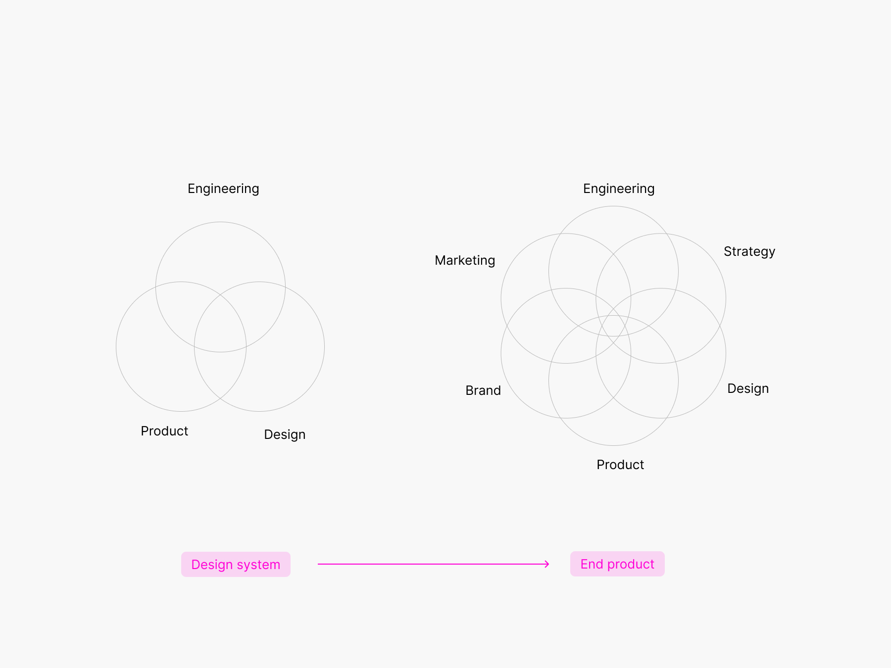
Design systems are designed, built and maintained by the classic EPD orgs. This doesn't reflect the full list of ingredients involved in the end product. Design systems are often not covering the full atomic design range.
One of the biggest advantages atomic design provides is the ability to quickly shift between abstract and concrete.
Design docs site provides few examples of how the system is actually used. When it does, it's in isolation, to fit the sitemap. You see the button specs on the button page, maybe a hero or section with buttons, tags linking to other uses of the components.
The only way to see the final end product is to find it in the wild. Blog posts or changelogs offer some visual reference but are often scarce. We can do better.
A suggestion
I believe in exposing the end-to-end process.
Process artifacts provide insights into how a system has developed. By examining various iterations, one can anticipate the next steps or understand all the characteristics that have undergone changes. Even if the reasons behind the changes aren't immediately apparent, the visual representation can reveal the modifications that have occurred.
Engineers have a cool thing: changelogs. Changelogs provide a record of all notable changes made to a project. Design systems have releases following the same format. Changelogs often focus on technical aspects and little visuals.
We need a sort of Design Changelog.
Although the nature of the log will be similar, it should be tailored to design to convey progress, changes, reflection, and inspiration. I see this design changelog as a portfolio showing the maturation of patterns coming together to form a coherent ecosystem.
What would the child of a changelog and a design portfolio look like?
DesignLog V0.1
Show the work. Each ship gets added to a folder labeled with the URL or relevant short title + date. Everything gets displayed in a feed sorted by quarters. The timeline structure is pivotal; do not sort by per project/team. No nesting is recommended to limit cognitive load and the need for advanced search.
I'm a strong believer in the idea of files over apps. Use existing & familiar tools to create a simple feed+post: folders, markdown with images.
One timeline view. One detail view.
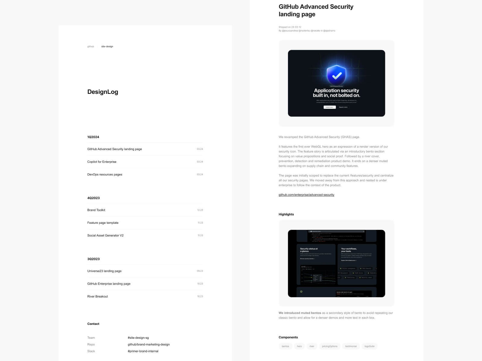
Each project gets a standardized markdown file:
- Title
- Publication date
- Type: Case study, shipped, long form
- Contributors @names
- Content: goals, challenges, highlights, layout, story, visuals and other assets.
- Optional annotated visual highlights
- Component used tagged # (to refer to design system docs)
The (markdown) format allows to cover both shipped items but also longer form content such as design principles, team processes and others topic that require depth. The default should be simple and can flex up. Treating the designLog as a standalone entity with its own front end gives it dimension and incentivizes good maintenance. It doesn’t need to be fancy, a simple PHP script reading a folder, hosted on GitHub pages will do it.
It is not:
- A metrics report
- Another Google doc or Dropbox folder
- A shiny portfolio
- Only a changleog with images
- As simple as a social post
But wait…
It's adding something to the docs. Wouldn't adding stuff make the problem worse by inflating the amount of content?
Finding where this lives is the key to unlocking its utility. The DesignLog could live within the existing design system doc platform or be its own thing. The crosslinking via component tags and contributors will weave the DesignLog in. The technical constraint may end up dictating the location.