February 28, 2024
Web design grids
We all stare at screens displaying information. Grids are the framework for arranging the information on the screen. The best resources on grids are often utilitarian and geared toward developers (CSS framework docs) or templates (web publishing platform). Web design is immature - compared to architecture, the most common comparison. This is a grossly oversimplified overview of web design grids.
History
Product design cannibalized most of the educational enthusiasm during the app boom. Since then the most extensive resources have been skewed toward product design. The great teaching tools from the golden era of print are still relevant but aging. Josef Müller-Brockmann's book sits on desks and shelves proudly, as an inspiring artifact more than a technical reference (at least from what I can tell).
Containers
Containers are the foundation of the grid. They contain the columns and are most often centered on the page. Sizes vary but rarely go over 1300px. There are common patterns but no set standard. On mobile the container flexes to 100% minus side padding.
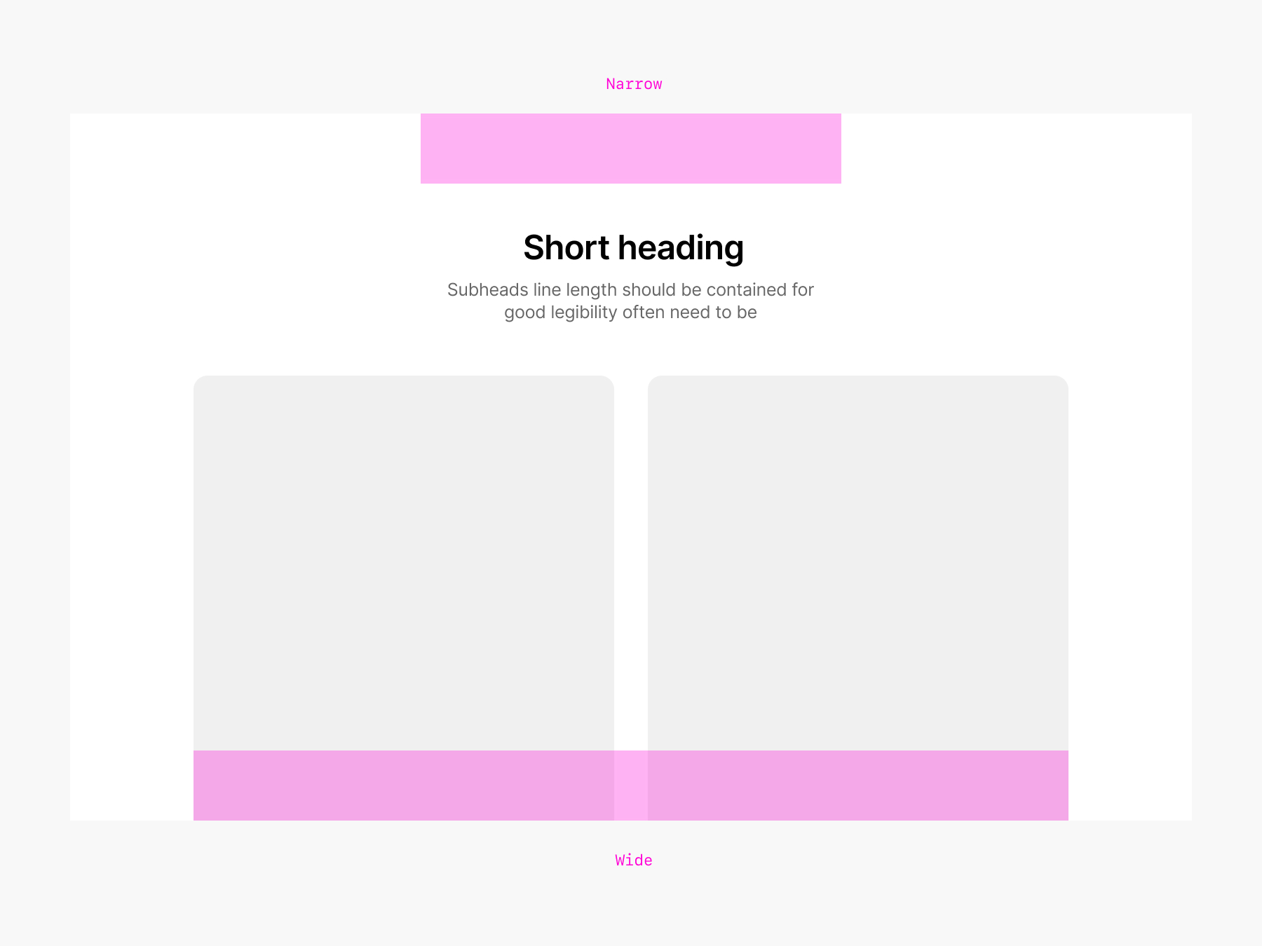
It's common to have 2-3 container sizes (narrow - regular - large) to accommodate different types of content. Large for image or video. Narrow for text or headings.
A few container sizes: 620px (this site) 960px (old school, love it) 980px (apple narrow) 1248px (bootstrap 5) 1280px (GitHub Primer) 1500px (Amazon)
Columns
Grids are most often defined as a fixed set of columns. Either centered (taking the full width of the container) or stretched (taking the full width of the screen) with a gap. The idea is to provide a visual guide to define the actual columns in which the content will be placed.
Generally, 1 to 4 columns will cover all layouts. Limiting the number of columns to a maximum of 4 allows for good density, even 4 columns are already very dense.
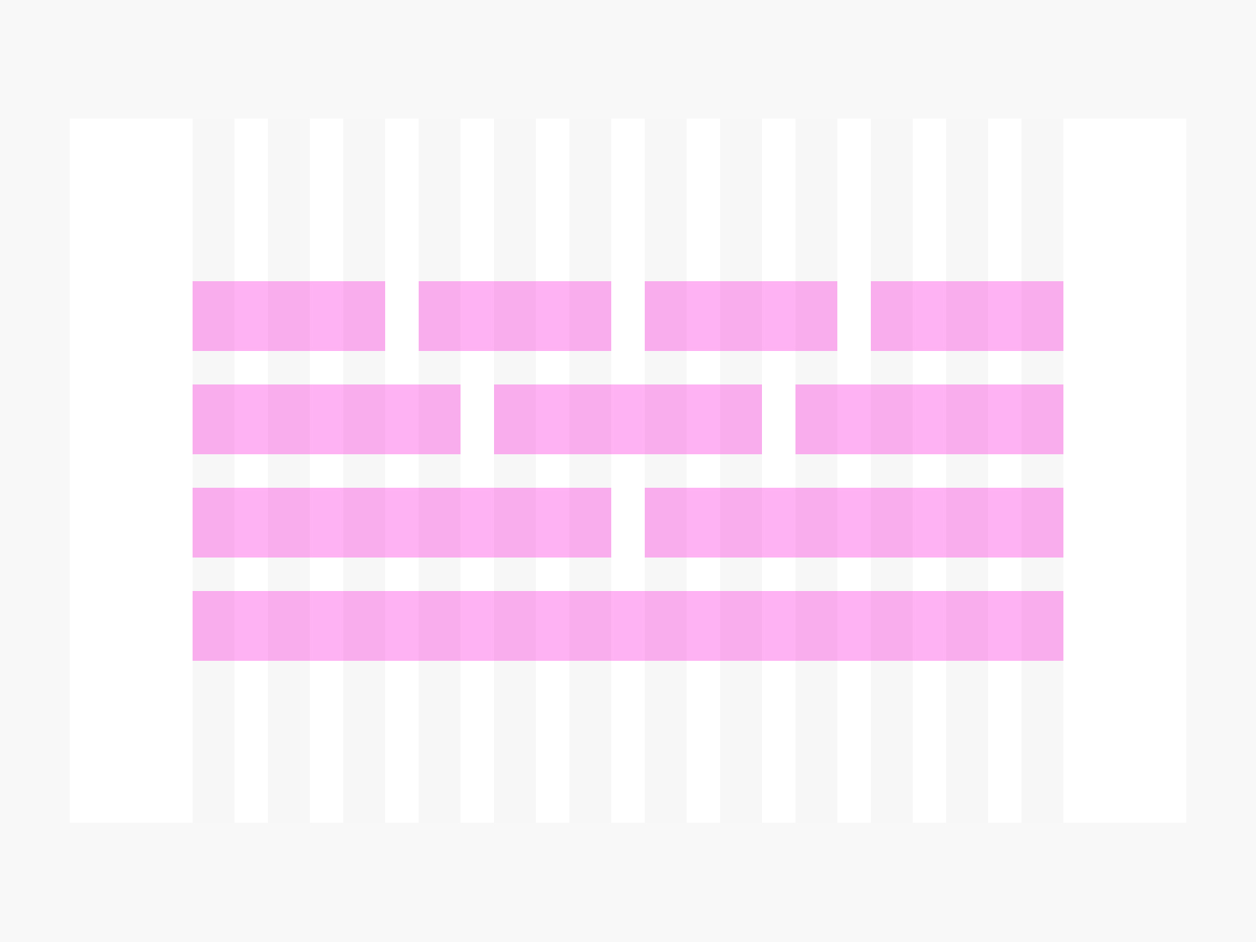
The grid itself is here only to define columns. You may not use it to avoid too much visual noise during design.
Mobile
On mobile (all screens under 800px wide) all columns under 50% width collapse into a stack of 100% width. By following a rudimentary set of columns (like the above), one can skip the struggle of the in-between desktop and mobile breakpoints (aka - tablets). This aggressive approach paired with responsive spacing and type scales, yields a strong layout base that will flex across all resolutions. Keeping up with screen size is not a viable strategy, hardware evolves quickly (and wildly). It's tempting, and sometime necessary, to make exception to this rule. In my experience, keeping to such a strict strategy allowed to scale layout and creative while covering 90% of the editorial web design needs.
Spacing
Gutters are the spaces between columns. They create an even horizontal alignment between the elements in a row, promoting consistent spacing throughout the layout. Nested elements can have their own padding or be aligned to the grid
- (empty) Columns can be used to create offsets
- Avoid nesting rows. Prefer stacking for elements within columns.
- Parent sections should have the largest top/bottom padding
- Narrower container = Fewer columns option
HTML
The grid structure translates into nested markup in HTML. Knowing and thinking of this nesting is an important part of working with grids.
<section>
    <div class="container">
        <div class="row">
            <div class="col-1-2">
                // Stuff goes here
            </div>
            <div class="col-1-2">
               // Stuff goes here
            </div>
        </div>
    </div>
</section>
Forward statement
CSS updates, new browsers, devices, and spatial computing will continue to enable new possibilities. The human eye and our attention won't get an upgrade anytime soon. The ever-increasing volume of content leads me to believe that layout is a major lever we should pull to promote a pleasant experience.